In the following series of articles, we will discuss what baselines are, how they work and how to apply them to everyday SQL Server performance monitoring. This article will provide a brief overview of baselines and the statistical calculations behind them. Later we’ll apply this to real information gathering techniques to allow DBAs to create their own baseline.
Every DBA should know what is normal for their system and what isn’t, for a given time period with a certain level of confidence. Otherwise, performance problems may go undetected and/or false alarms may be raised. This is where performance baselines come in.
What is base lining?
Simply put, a baseline is a known state by which something is measured or compared. In this article, we will, in essence, benchmark a system metric against itself, and in doing so we’ll create a baseline. We’ll use the baseline to compare against current performance and determine what is out of the range of normal within a certain level of statistical confidence
Base lining – historical averages
One way to start creating SQL Server performance baselines is to simply use the collected historical measurement average of the metric, of interest, for a baseline calculation. Then this data would be compared to the current measurements to see if there is something out of the range of the metrics which we consider to be normal, by visually estimating which points “seem” very far from the baseline.
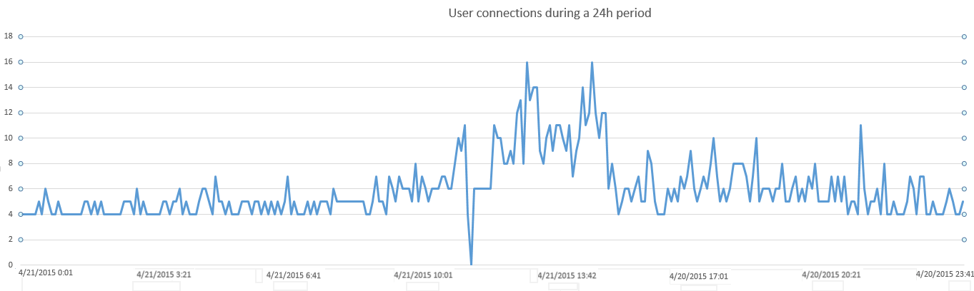
This example counter we are using identifies a number of users connected to our SQL Server database during a 24 hour period defined as the “sample”. This counter is collected every 5 minutes. Here are the initial plot points
Next, we want to calculate the mean historical value and plot it against our dataset, using it as a baseline of historical performance, as shown below
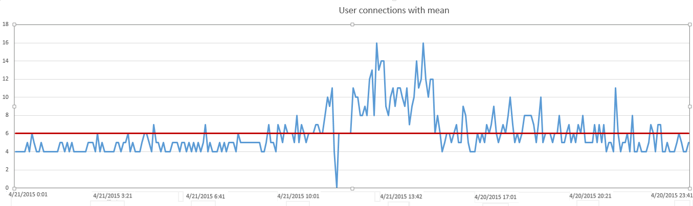
This is a good start in that we can see exact measurements that are higher than the historical average and lower. We see peaks and troughs across our sample time period with a bit more accuracy than simply using the human eye. We can think of this as using a reticle for a sniper scope vs iron sights
But what about a situation when what constitutes “normal” changes throughout the day? For example, what might be high at 2 AM in the morning could be relatively low at 2 PM in the afternoon. This environment could have peak periods of use, and periods of no use that happen consistently and predictably. Simply comparing these measurements vs an average of all the date points throughout the day regardless of historical patterns during certain periods of time, doesn’t effectively baseline against “normal” for that period. It baselines against normal for the entire day. But for our purposes, a full day is too long of a period to create an average on as “normal”.
Our challenge then is to more granularly measure “normal” for a particular time period and then re-compare our measurements against this.
Base lining – shorter time periods
If we want a better baseline that can more accurately isolate performance problems during certain sub-periods for our particular sample, we need to calculate the average number of users per hour
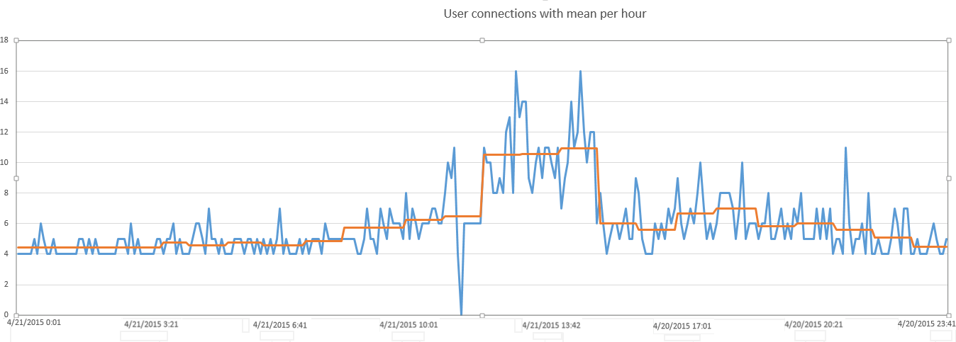
With this more granular measurement applied to create a “rolling” baseline, we are now able to see, much more effectively, which measurements are truly high vs those which may simply be higher than the daily average but are still quite normal for the given time period.
But now another challenge becomes obvious. We still have many points about our average, but how can we tell which ones are outside the range of normal vs data points that simply reflect normal volatility within the statistical range of normal. We can guess and cherry-pick some measurements that visually stand out but without the help of a statistical calculation, there is no way to ascertain, with any certainty, whether a particular measurement should raise concern.
What we are looking for is a means to isolate those measurements that are simply higher than “normal” but not to a degree of statistical certainty to warrant concern vs measurements that are definitely beyond a normal threshold and should be isolated for closer examination
Base lining – Calculating standard deviation
Standard deviation is a statistical measurement of the variation in a data set. It indicates how much the values of a specified data set deviate from the mean. It is calculated as a square root of a variance where a variance is an average of the squared differences from the mean.
The 68–95–99 rule in statistics is used as a shorthand of the percentage of values that in a normal distribution fall between the mean and the 1st, 2nd, and the 3rd standard deviation, respectively.
This means that 68% of the data sample will fall within the graph line of Mean +/- 1 standard deviation, 95% +/- 2 standard deviations, and 98 +/- 3 standard deviations
By layering these thresholds of standard deviations on our data, we can begin to isolate the statistical outliers. By setting our threshold at 1 standard deviations we can see 7 data points that are above normal as shown below
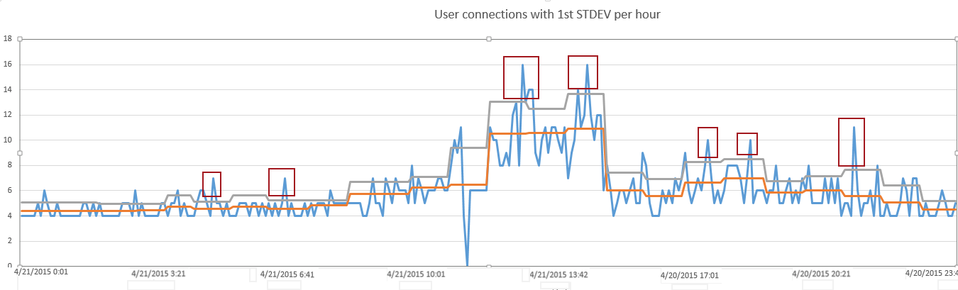
But by applying another threshold of 2 standard deviations, we see only 3 data points that are in the top 5% of all measurements
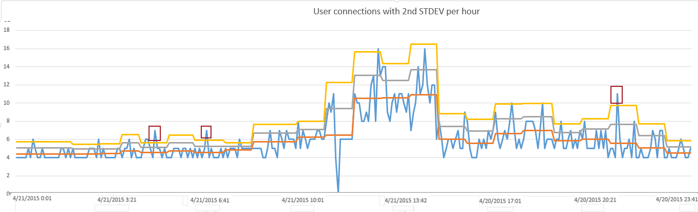
By creating a granular baseline in hourly increments and then measuring the volatility of data in creating 2 thresholds on top of this baseline, we’ve successful isolated 3 measurements that would be worth examining. At the same time, we’ve avoided having to research measurements that weren’t statistically significant deviations from normal.
If this system were automated with an alerting system, alerts could have been triggered from these 3 measurements to provide real-time notification of potential problems
Useful resources:
Data Collection
Establishing a Performance Baseline
May 4, 2015